Customer Support
Client
White River Marine Group
My Role
UI DesignerUX Designer
Summary
I lead UX and UI design on a multi-brand, Oracle based customer support website.
Problem Statement
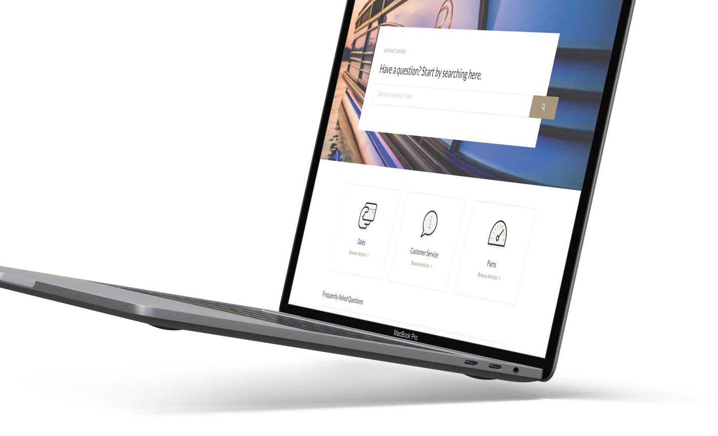
White River Marine Group is the largest boat manufacturer in the world, producing brands like Tracker, Ranger, Nitro, Mako, Sun Tracker and more. With the internal transition to Oracle Service Cloud, each brand required a new website to support the new framework.
In addition, the legacy customer support websites had many UX problems that needed to be addressed. In short, it was difficult for customers to find answers to their questions.
Project Goals

Give users a clear and familiar experience for asking questions and finding answers.

Simplify the interface to allow users to focus on the websites core functionality.

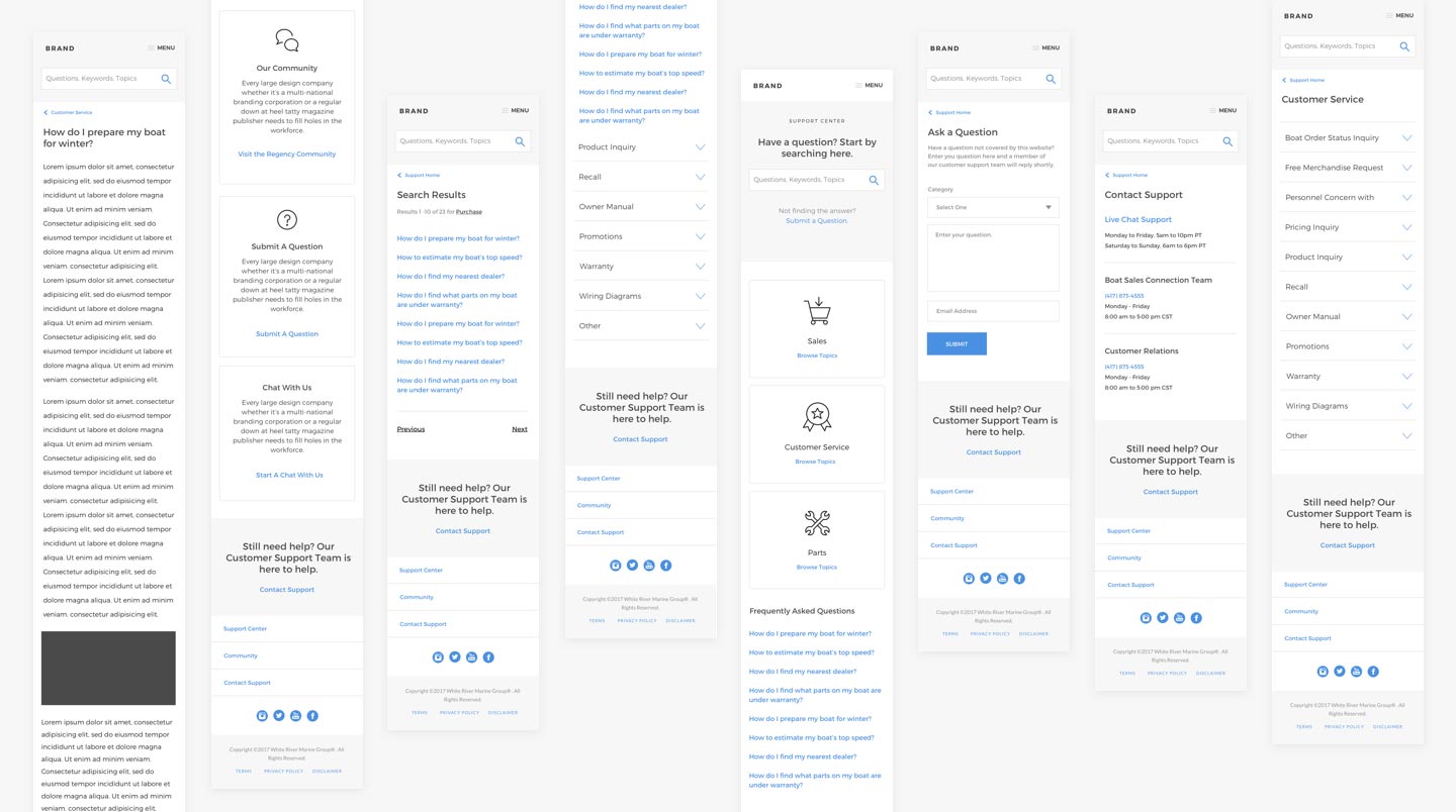
Design mobile first, based on the knowledge that most users will access the site on their devices.

Create a seamless experience cross brand while planning for the site to utilize each brand's unique style guide.
Approach
I started by focusing on designing a support website, regardless of the brand or product. I wanted an experience for users that was extremely familiar and simple to use. Because support websites heavily rely on valuable content, I wanted the design to disappear, allowing the user to focus on what they needed.
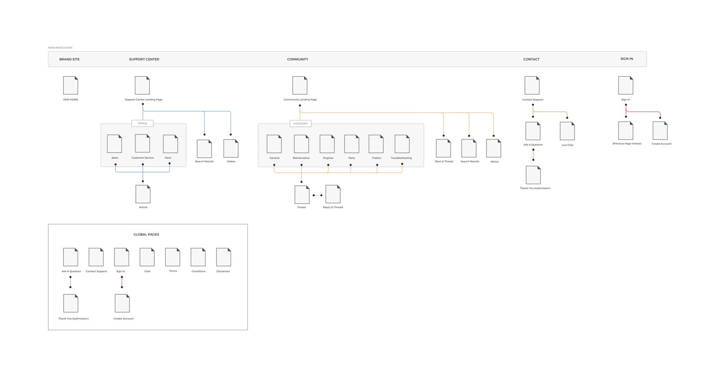
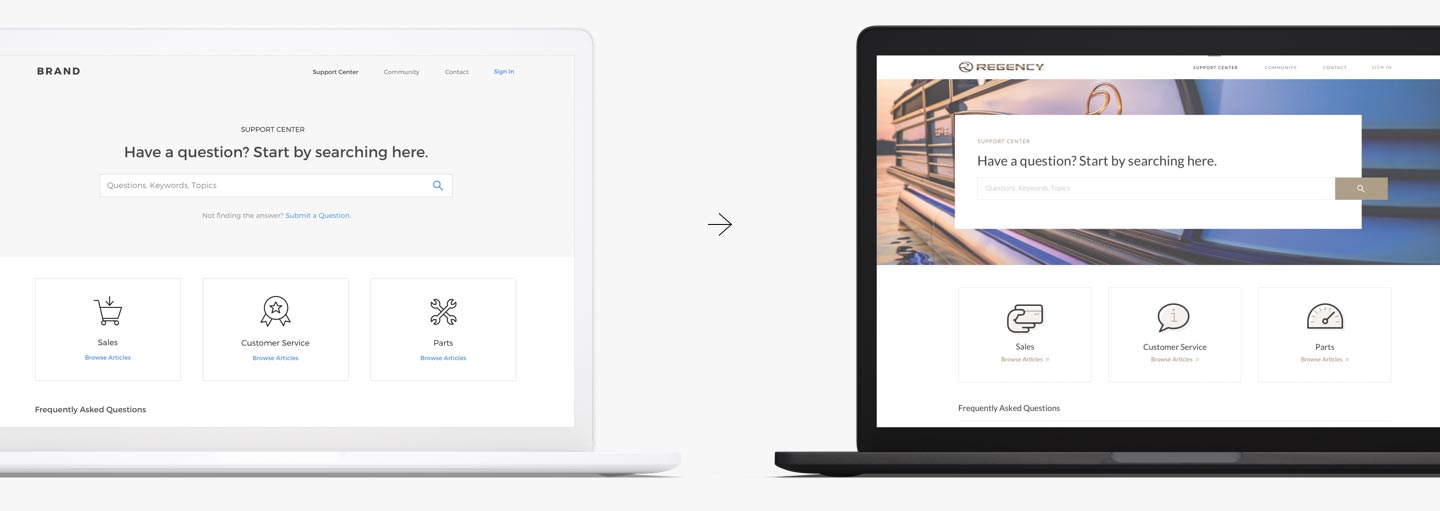
After initial flowcharts, I mocked up a wireframe and used InVision to build a basic prototype to test with users. This brought a few rounds of revisions along with discussions with the development team.
Fidelity Evolution
Research Methods

Market Research Analysis

Prototype Testing

Information Architecture

Customer Interviews
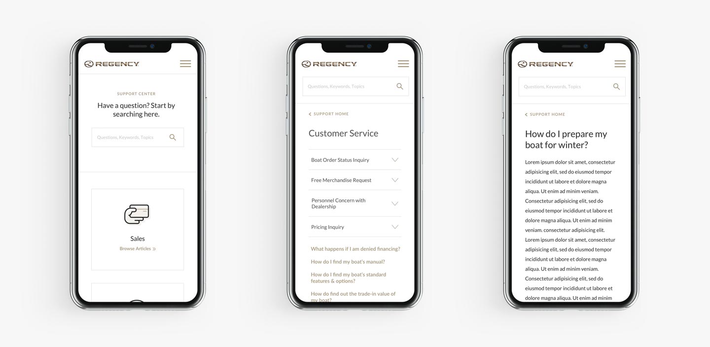
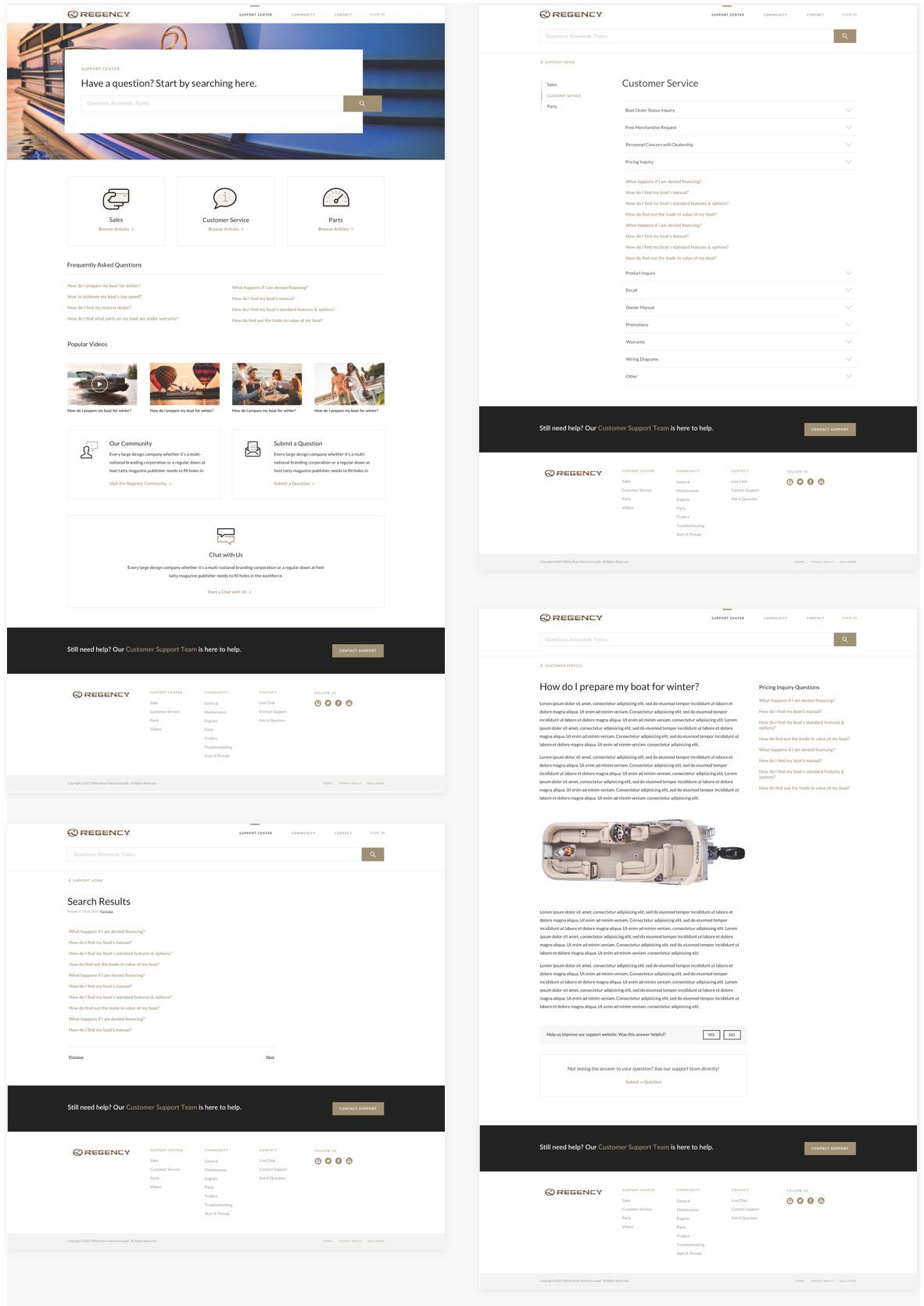
Multi-Brand Design System
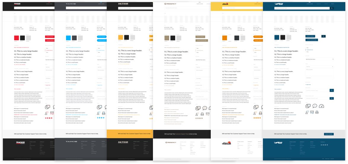
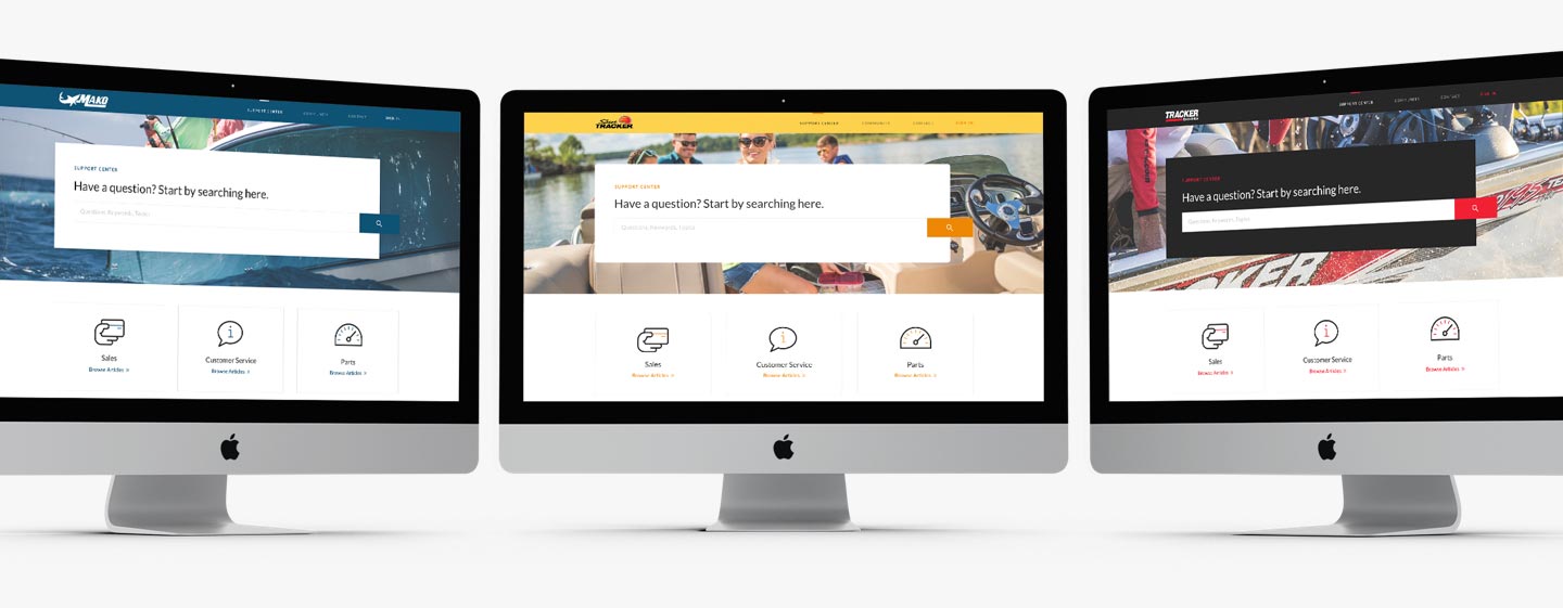
Learnings
This was a project where knowing the limitations of the platform and pre-existing business rules was very important. In order for me to design efficiently, I needed to understand out-of-box functionality of the Oracle platform. This was increasingly frustrating at times, but in the end resulted in less than 10% custom development.
The design process for this project also opened opportunities for internal improvement. In order for a user to be successful, the content needed to be helpful and well organized. This was an opportunity for UX to show value behind the interface.
