Industry Ventures
Client
Industry Ventures
My Role
Brand DesignerUI DesignerUX Designer
Summary
I lead design on a visual refresh of the branding and website a leading liquidity provider.
Visit Website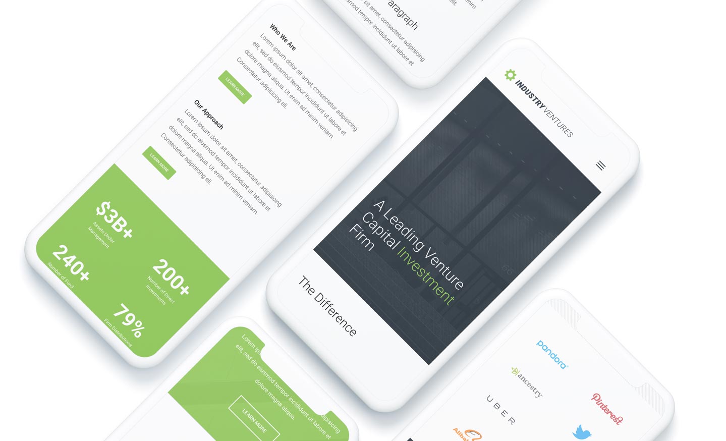
Problem Statement
Industry Ventures is a well known venture capital firm with offices in San Francisco and Washington DC, working with big names like Twitter, Facebook and Alibaba. The came to me looking for visual refresh that better aligned their quality and expertise with the investments they work with.
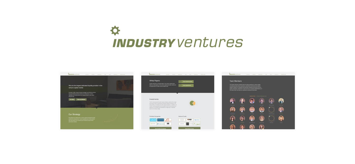
Their current branding needed refinement and a new color pallet that replicated well on various mediums. Their website lacked depth and structure to build a solid case for what made Industry Ventures different.
Project Goals

Refine branding while maintaining a familiar look. No major departures from original branding.

Design a web experience that quickly and effectively conveys the Industry Venture’s core values and approach.

Design a robust news and article system build for Wordpress so authors and quickly publish content.

Redesign email marketing template for an improved mobile experience.
Approach
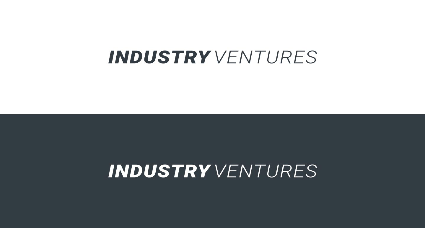
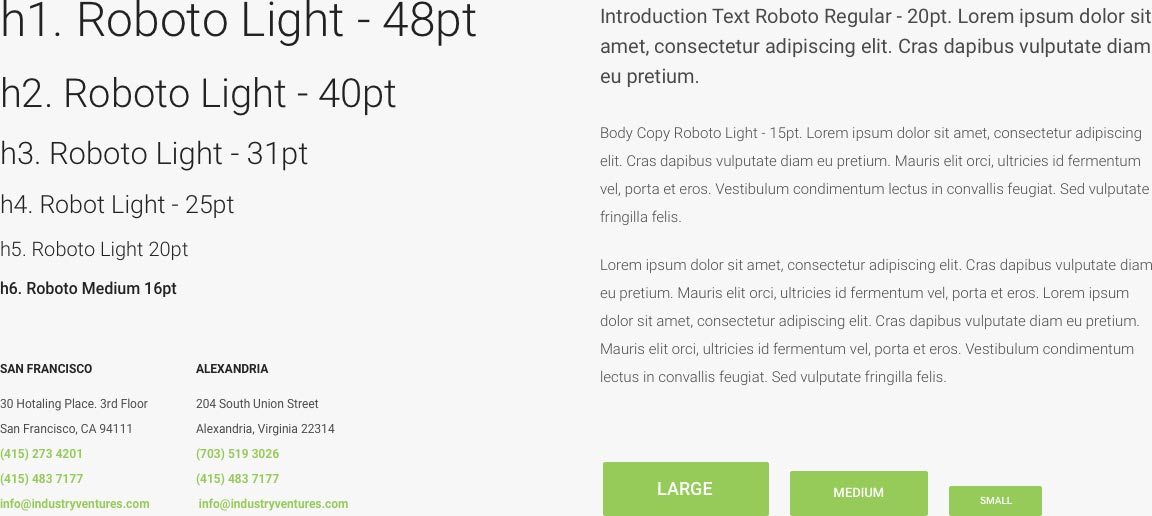
I started with refining the brand. This was an exciting opportunity for me to focus on very specific details, enhancing the brand with every curve and letter. We worked though many variations of shapes and color pallets, careful not to stray too far from the original. Overall, we wanted to elevate the brand to visually stand alongside the multi-billion dollar companies they work with.
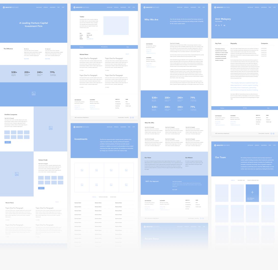
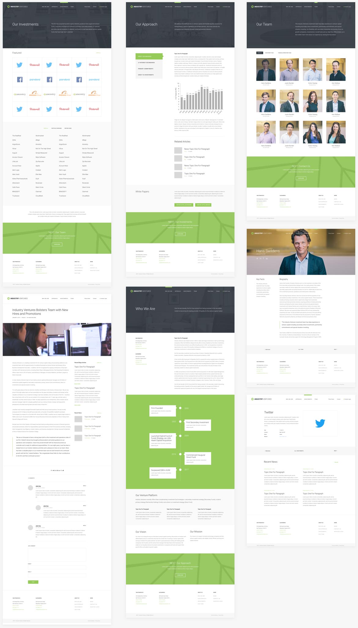
Next, I began to break down their website content. I wanted to know and understand everything about Industry Ventures. I broke the content down into sections and began to wireframe out an experience. I wanted users to flow from one page to the next, easily grasping the content of a typically complex business.
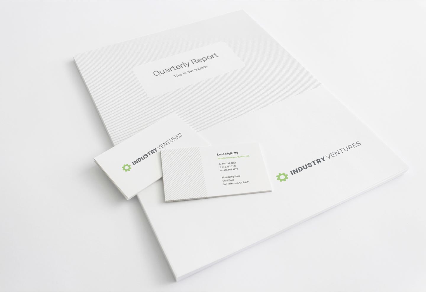
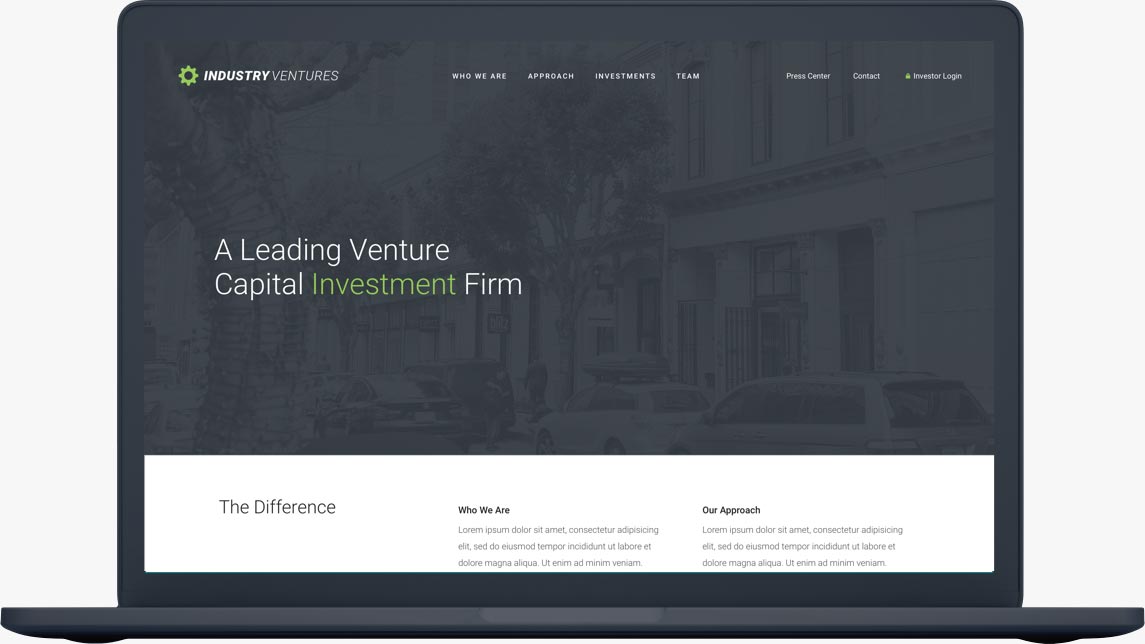
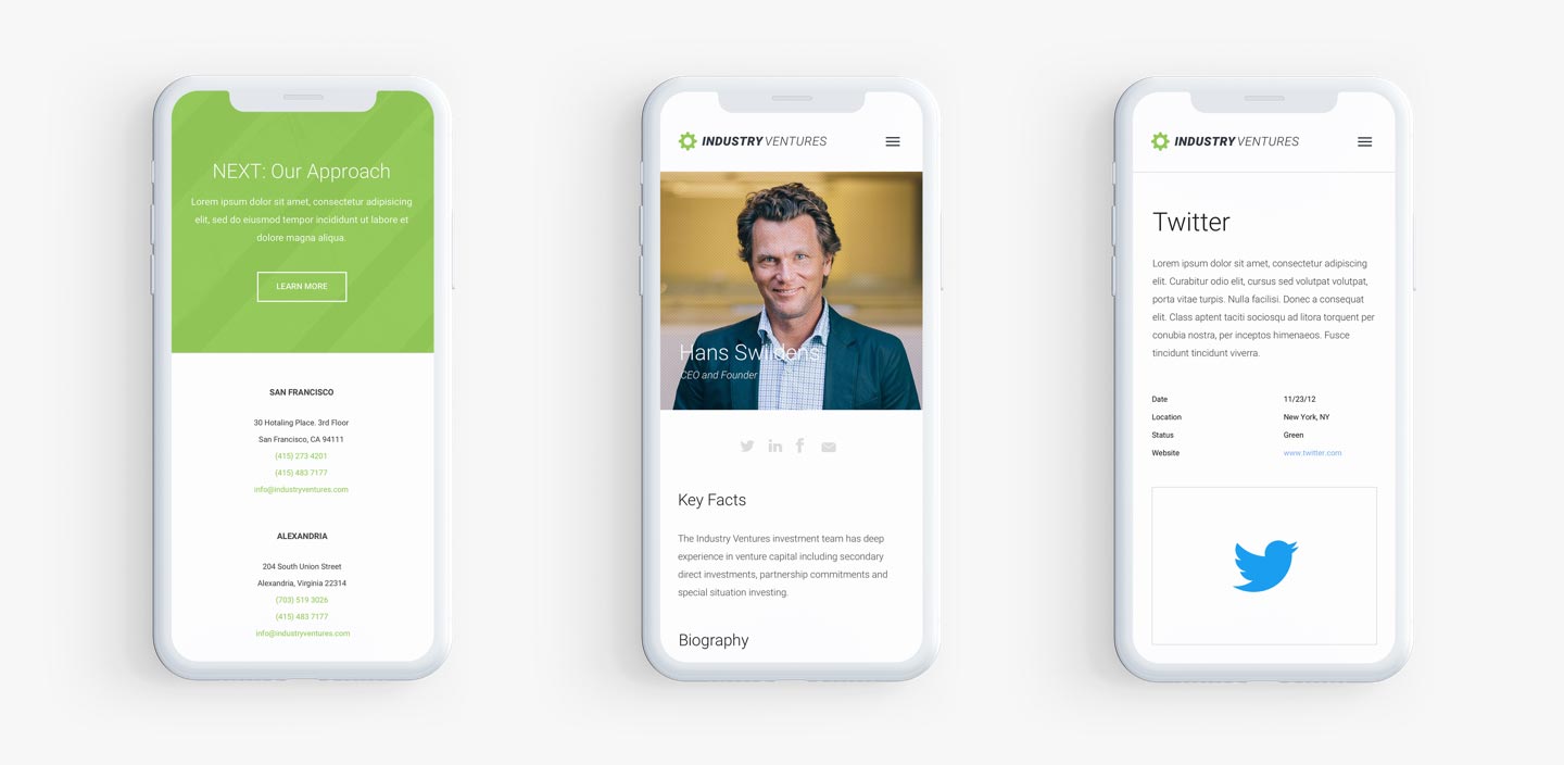
After testing the wireframe prototype, I began to apply the new branding to the website UI, designing out the entire site. During development, I also worked on a new brand kit including new business cards, letterhead, powerpoint templates and more. After the website was launched, I also worked on a new email template for their marketing campaigns.
Logo Anatomy


Color Pallet
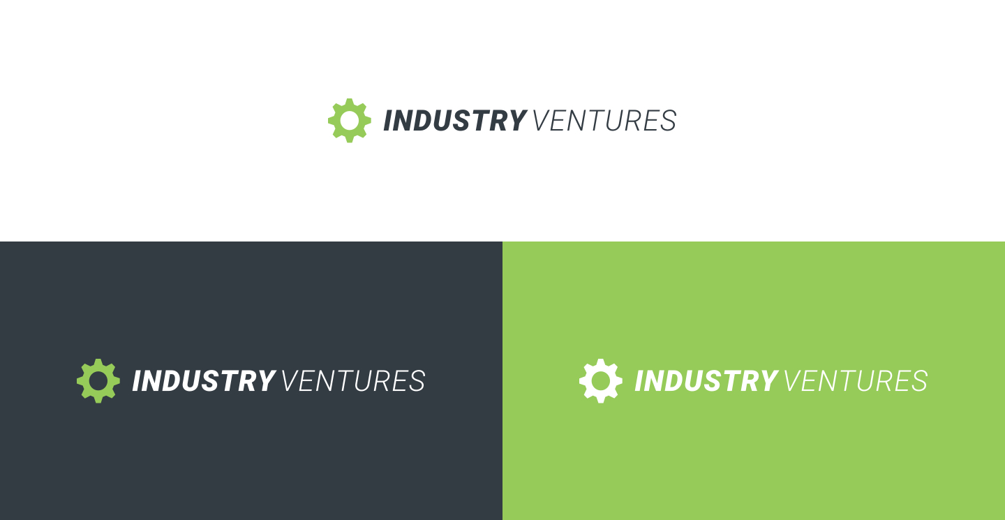
I started with refining the brand. This was an exciting opportunity for me to focus on very specific details, enhancing the brand with every curve and letter. We worked though many variations of shapes and color pallets, careful not to stray too far from the original. Overall, we wanted to elevate the brand to visually stand alongside the multi-billion dollar companies they work with.
Color Pallet

Research Methods

Market Research Analysis

Prototype Testing

Information Architecture

Customer Interviews
Learnings
This project taught me how much I love refinement. As one of the few clients I’ve worked with that didn’t want a complete overhaul, I was able to focus on small improvements that took the brand to the next level. The result was a successful project that didn't catch anyone off guard. Instead, people noticed the refinements we made and saw the value in the design process.
