Bass Pro Boating Center
Client
White River Marine Group
My Role
UI Designer
UX Designer
Front-End Developer
Summary
I lead UI/UX and front-end development for the launch of a national inventory and dealer profile application on an existing Adobe Experience Manager website.
Visit Website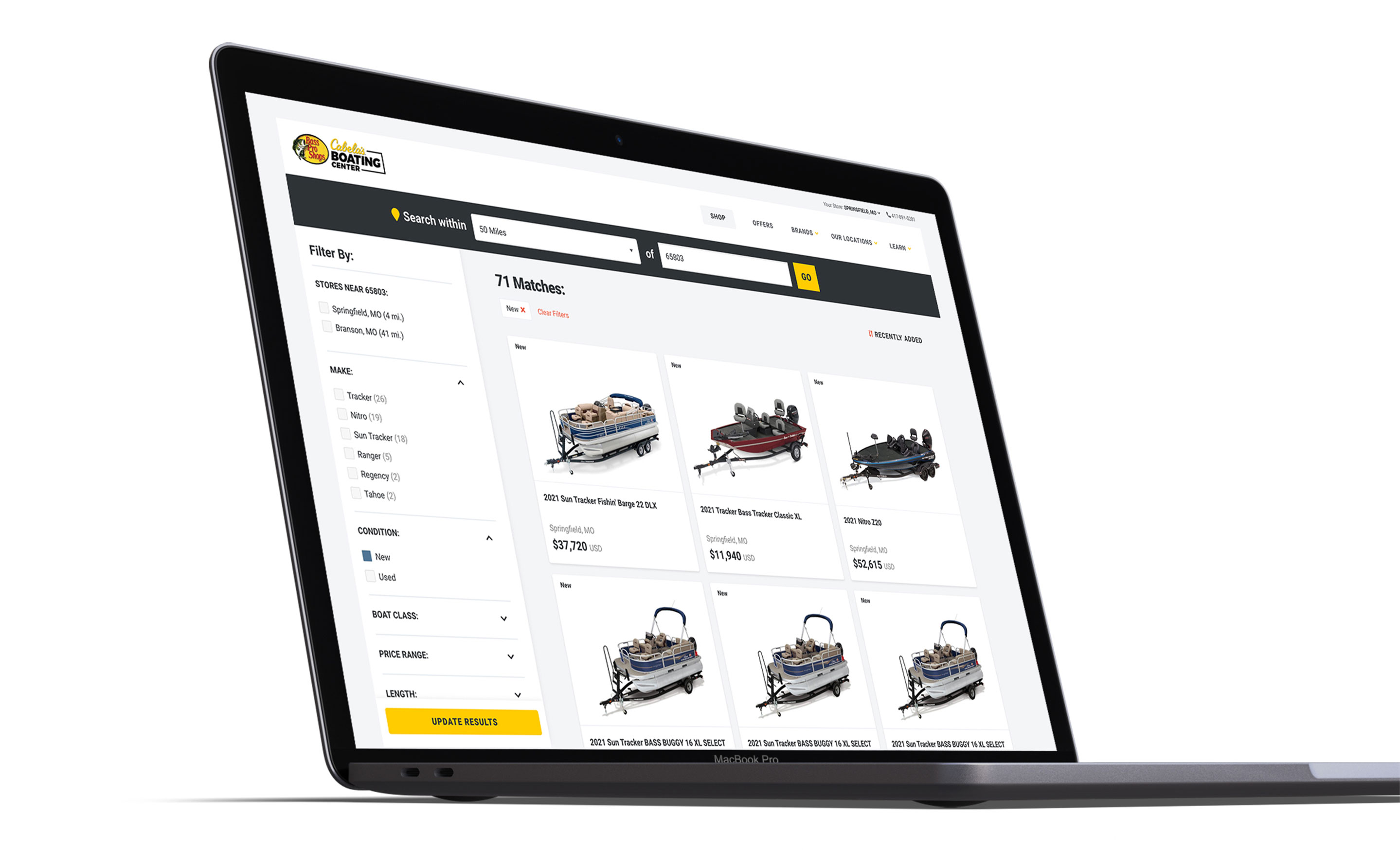
Problem Statement
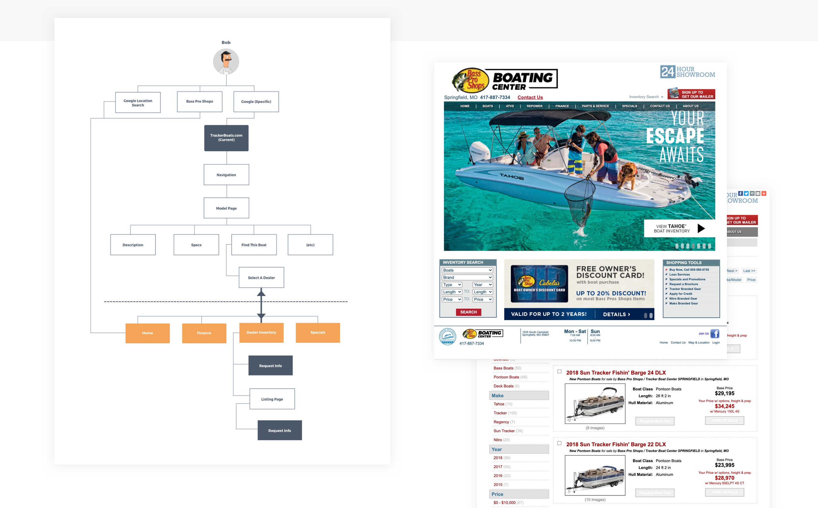
Early in my time at Bass Pro Shops, I was challenged with providing a long term solution for our company owned dealer inventory network inside Bass Pro Shop and Cabelas stores. At that time, each location had an independent website with its own store information and current inventory selection. They were also non-responsive websites with no mobile presence on a legacy platform that was set to depreciate.
Being that this was crucial information for end-of-funnel shoppers, I knew I was sitting on a special opportunity to provide tangible, real results with our approach with the design.
Project Goals

Increase overall traffic, online leads, and conversion rates for all locations.

Migrate to our company wide design system within Adobe Experience Manager

Provide constant consideration for SEO and digital advertising with our approach to URL's and UX to give better exposure to specific boat/off-road models and store location information

Create a more seamless experience between basspro.com and cabelas.com for customers shopping boats and off-road products
Original Experience
Approach
Early on in the ideation phase, I pitched the idea of consolidating all websites, into one national site. Here, we would have the ability cross pollinate products, allowing customers to shop inventory regardless of the location. This concept alone gave us huge opportunity to expose product that would normally be missed if a user didn't work hard to discover it.
We also saw an opportunity for dealer information to be consolidated into "profiles" where users could quickly navigate to and learn more about that location, shop only their inventory and reach out for appointments, service, etc. We talked with several SEO experts about the potential impact a site like this would have on our current ratings and came to the conclusion, that it was a home run.
Timeline
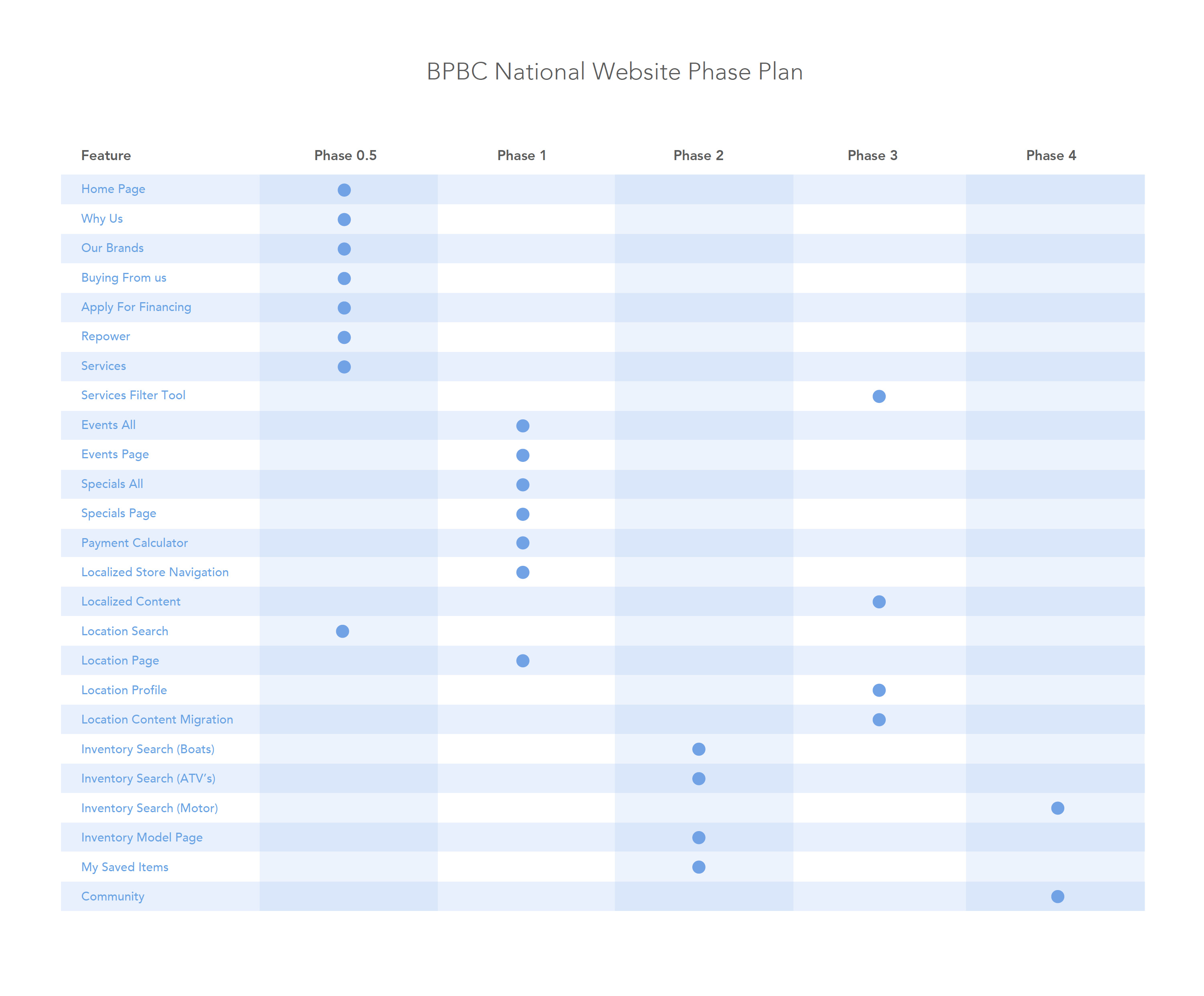
The pitch wasn't a hard sell and it quickly became the focus of the project for the next several years. We only needed the infrastructure to support it, which would take time. So, I worked to provide an iterative plan that would put us on track to deliver the end goal. It essentially broke down like this:
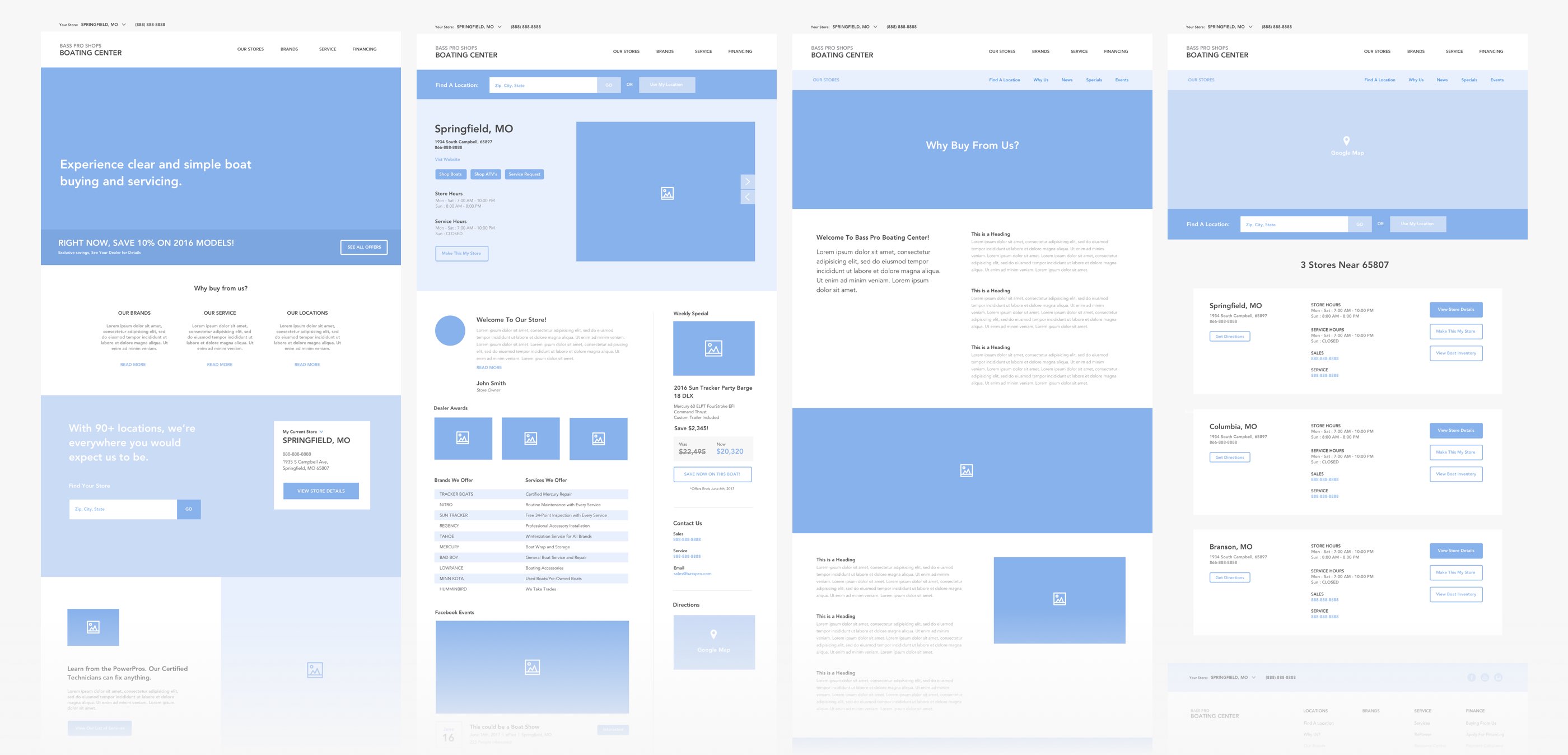
- 2016 - Design first concept of the end product, along with unavailable components/data stripped for a first version.
- 2017 - Launched first national website for Bass Pro Boating Center on AEM with content and basic dealer information only.
- 2018 - Launched company wide design system for AEM and migrated the site to utilize
- 2019 - Design and build front-end experience for the inventory application and dealer profiles
- 2019 - Delivered backend API to support a national inventory
- 2020 - Launched full experience on top of existing site for national inventory and dealer profiles
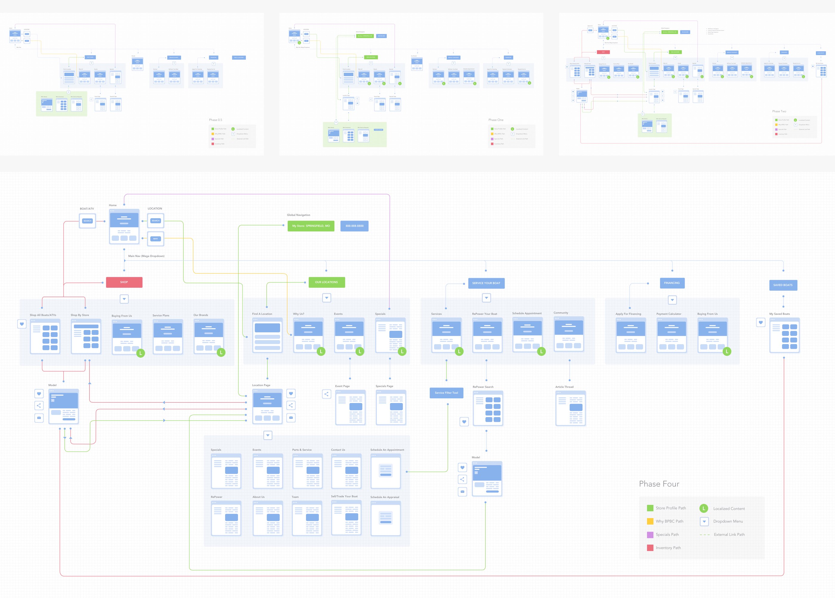
Iteration Flowcharts
1st Iteration on AEM
The first step was crucial in the larger plan. We needed to build national site on Adobe Experience Manager that would serve as the start of a national presence for all our dealer locations. Intended to be a quick release project, this site was built on basic AEM components and little custom functionality. This gave us a framework to begin creating SEO value, and content for a national voice.
AEM Design System
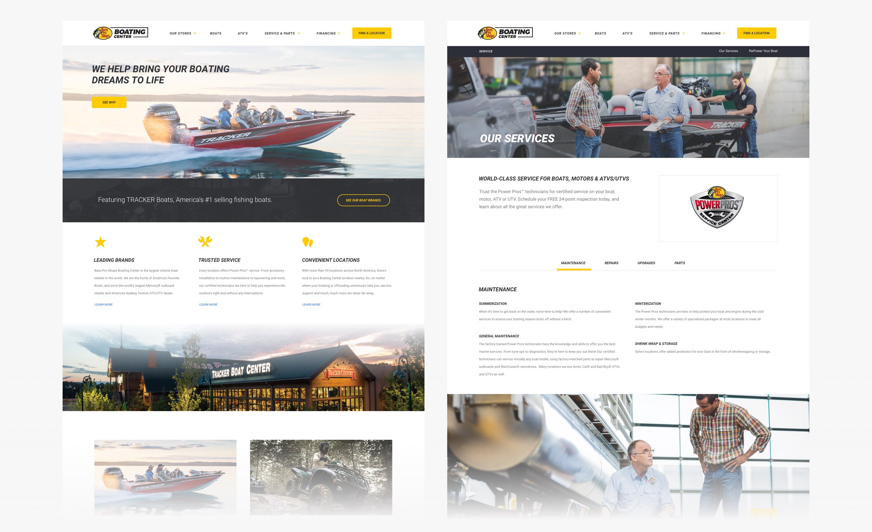
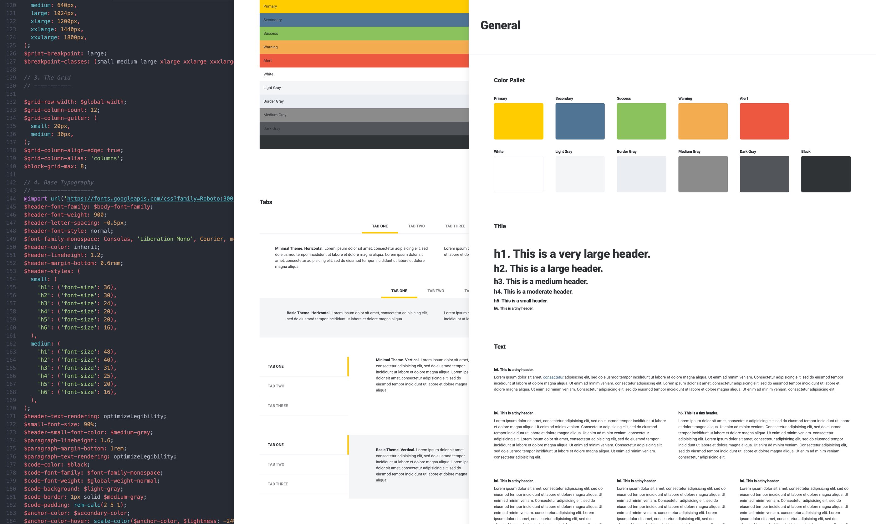
Over the next year, our business would see growth and acquisitions of new brands into our responsibility. It became clear we needed a central design system for Adobe Experience Manager that would allow us to design, develop and maintain our AEM sites. This kicked off the AEM Component Library project (Read more about this project) that would serve as our primary "set of tools" for AEM. After the project was complete, Bass Pro Boating Center became the second website to adopt these new components. As a result, the core front-end of the sites UI was complete, ready to take on development of our inventory application.
Development
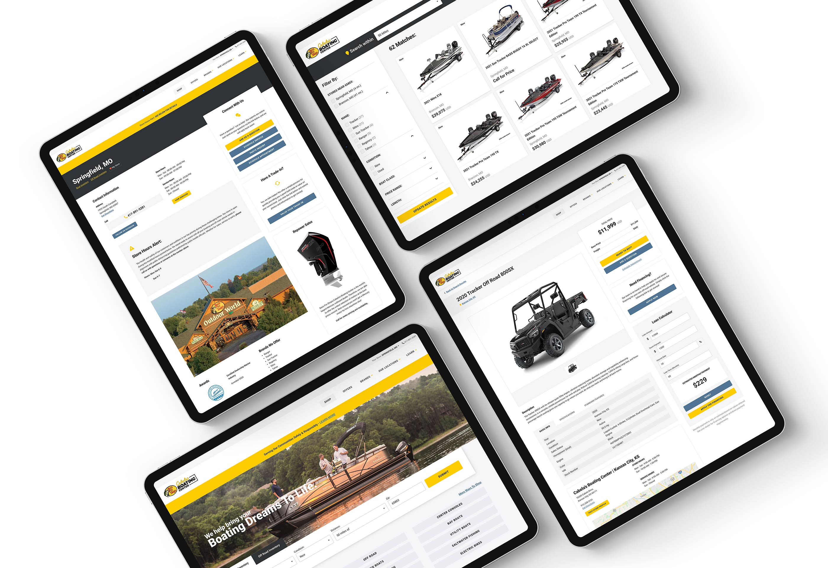
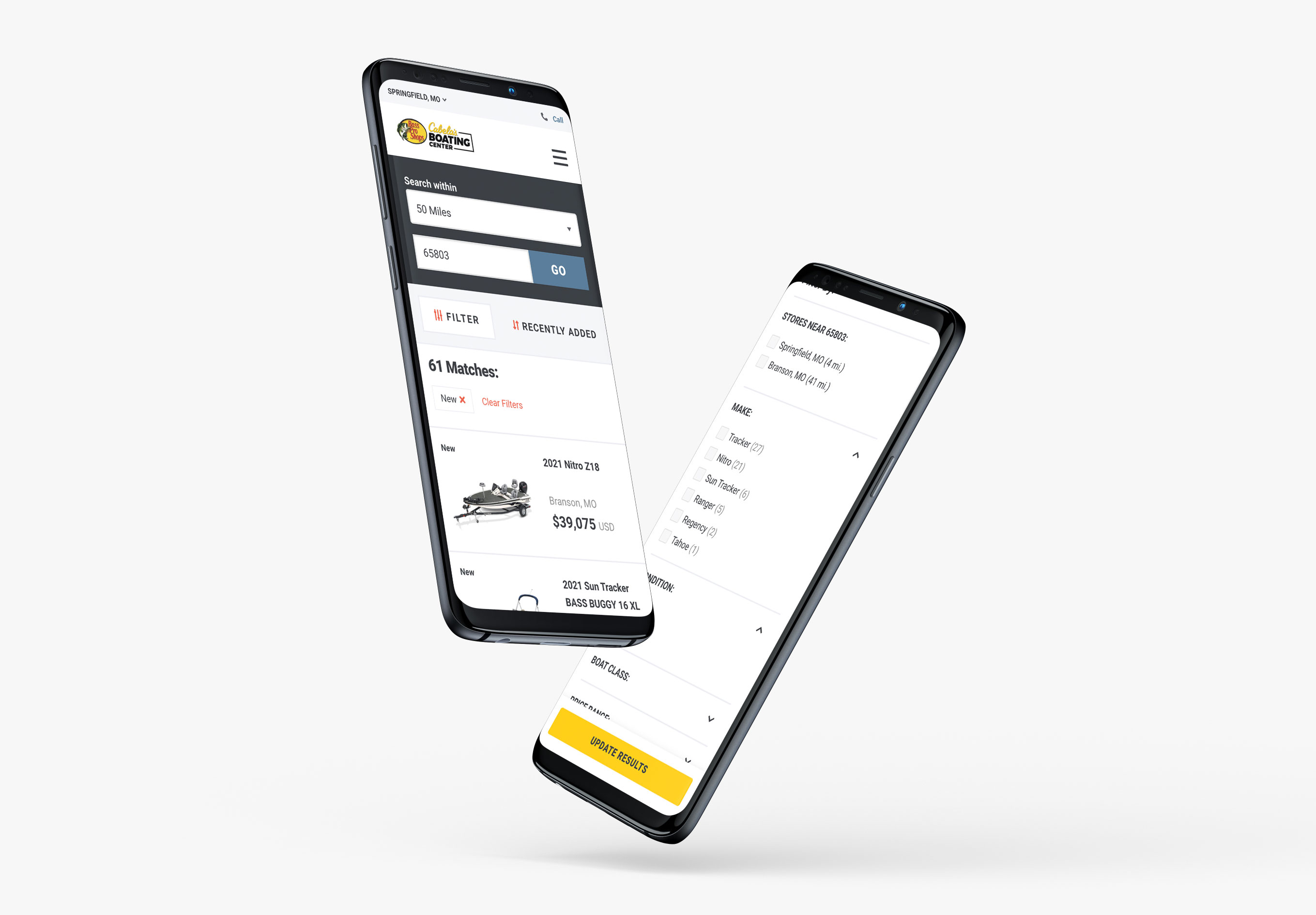
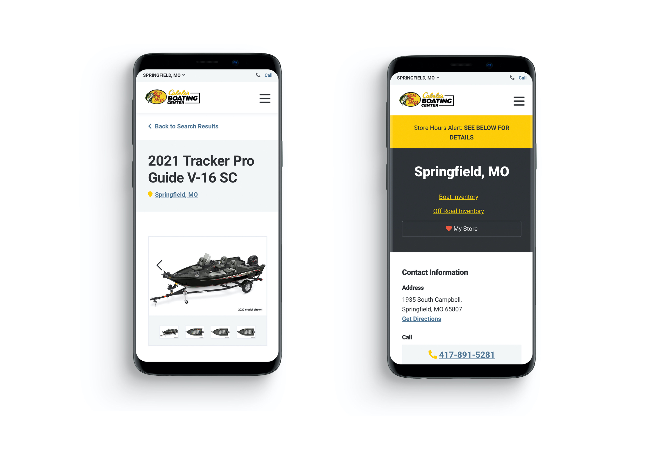
While the back-end infrastructure project was underway, my job was to build the front-end components that would connect the overall UX. The final experience broke down to 5 major components and templates.
- Global Store Header Navigation
- Homepage Search Box
- Inventory Filter Application
- Product Page Template
- Dealer Profile Page Template
Authoring
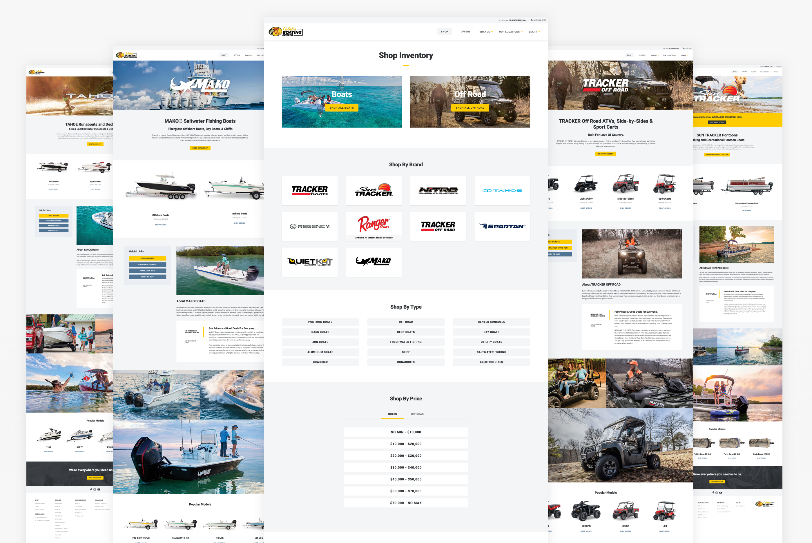
An exciting side effect of this project was our conversations around URL structure and SEO strategy. Our goal was to make the inventory application centered around a friendly URL naming convention. This gave us the ability to use an unlimited range of search parameters within our button component. While this could have been done dynamically, our approach gave us options for how we wanted to design the integration of the inventory into the rest of the site.
The last few weeks were focused on building dealer profiles, recategorizing navigation and updating landing pages to utilize the new UX.
Learnings
This project to me is a perfect example of how iterative design and patience can result in incredible improvement. The reality we lived in was no different from any other enterprise level business. We had numerous ongoing projects, set backs, and unplanned work that contributed to the length of this project. I believe the success of this project is due to the early planning we did. Our end goal never changed, but we were agile enough to learn and adjust to turn that goal into a reality.
So far, this project has exceeded business goals. We have seen incredible growth on all fronts. It's exciting to see where we came from and how we will continue to iterate in the future.
