AEM Design System
Client
White River Marine Group
My Role
UI Designer
UX Designer
Front End Developer (SASS)
Summary
I lead UX and UI design on a multi-brand component library for Adobe Experience Manager.
Problem Statement
One of the powerful features of Adobe Experience Manager (AEM) is the ability to create multiple websites on one instance of the product. This gives internal teams incredible flexibility to create content when needed with minimal support from IT teams. This is not easily implemented as the team learned from multiple website projects the risk of duplicate components and non-shareable code, creating silos of independent websites.
The solution was a design system, based on Atomic Design principles that grouped common elements from all websites in to one cohesive component library. The concept allowed internal teams to quickly spin up new websites, apply style and start authoring, without touching the core component JAVA.
Project Goals

Define essential AEM components for creating any basic website for White River Marine Group.

Incorporate framework classes to allow ultimate flexibility for authors.

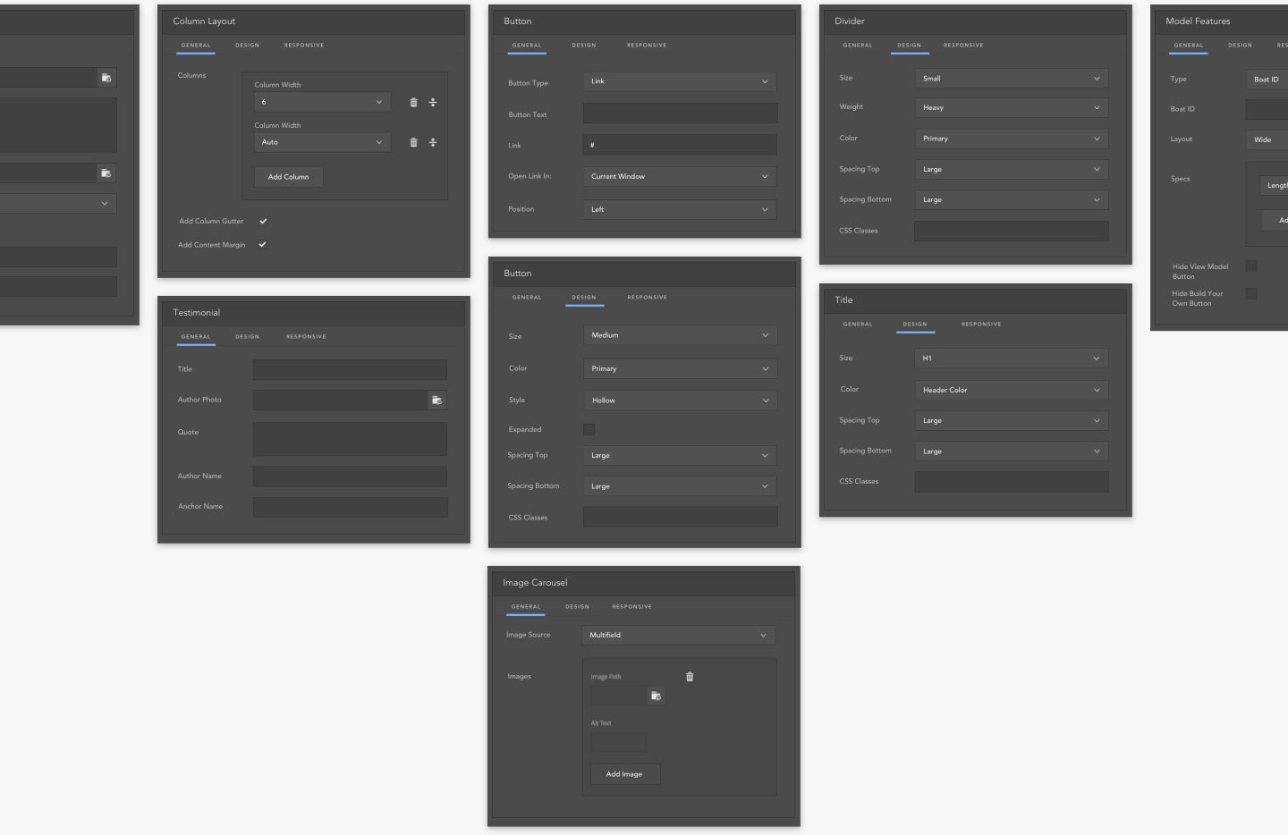
Focus on the UX for authors. Design AEM dialog boxes with consistent patterns, focusing on usability and familiarity among sites.

Design thoughtful SASS environment to give front end developers and designers the ability quickly style components.

Build a Sketch design system for designers to utilize shared symbols that seamlessly integrate into the component library for new website projects.
Approach
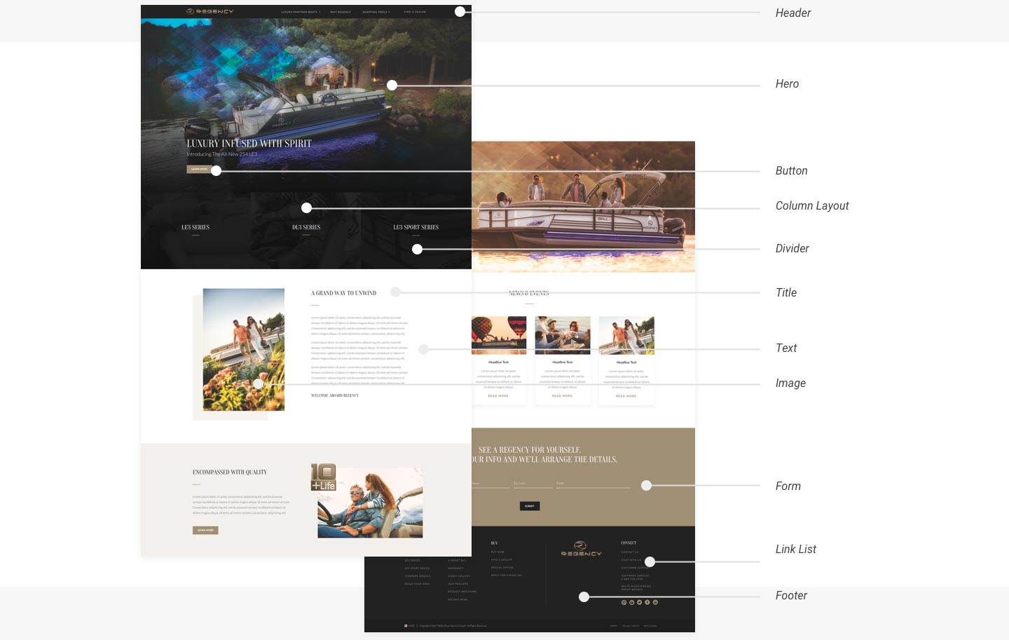
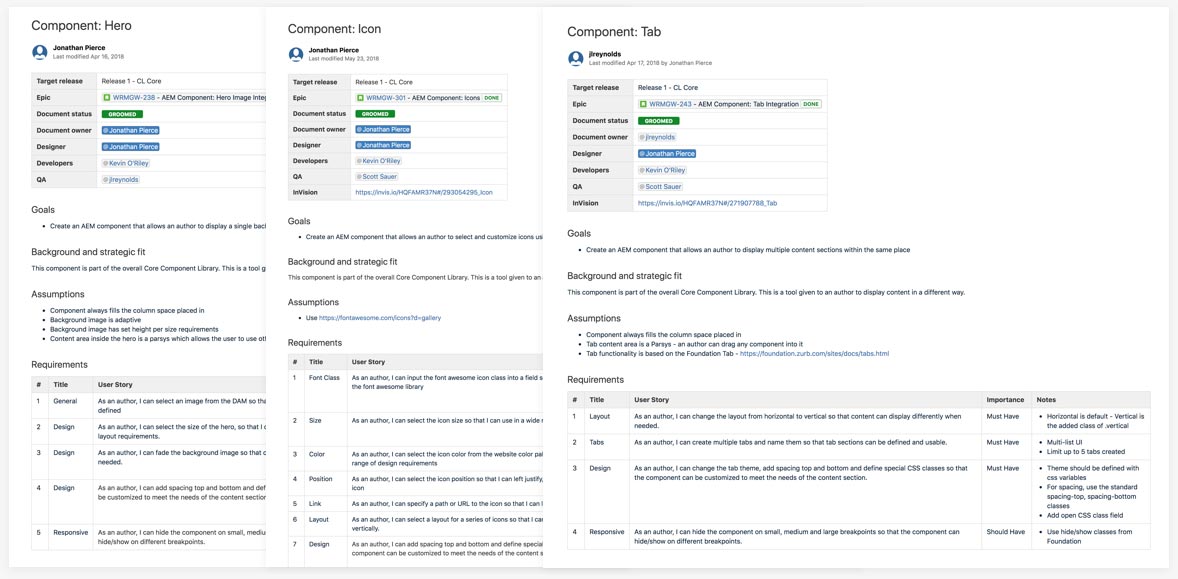
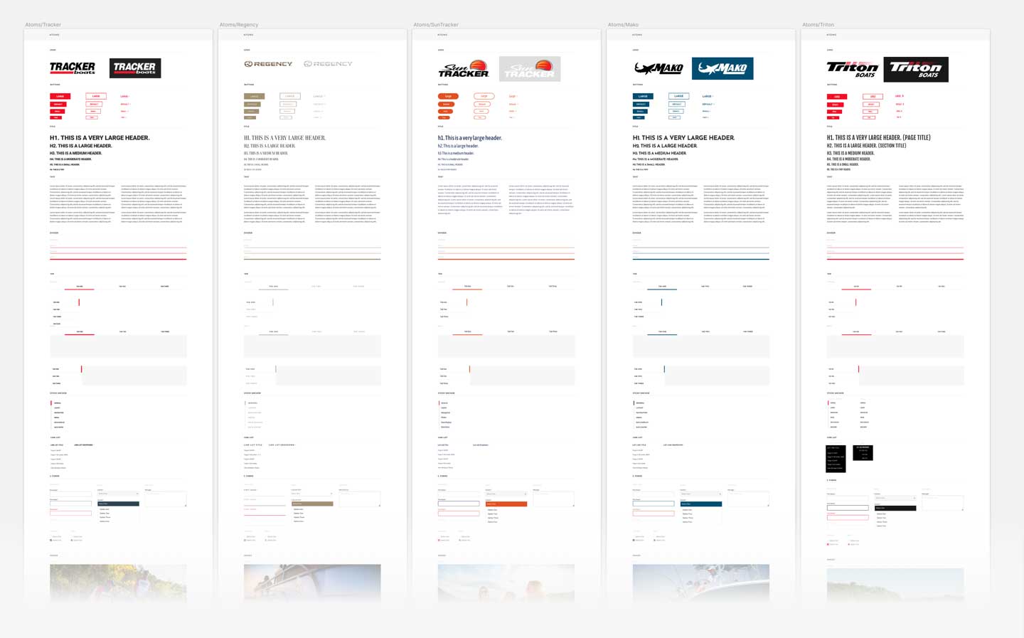
In order to build a design system that met the needs of White River Marine Group and it’s brands, we needed to understand all differences and similarities of each website. First, we began by applying the rules of Atomic Design by dissecting current and future designs into atoms, molecules, organisms, templates and pages. This allowed us to see a breakdown of would need to be considered an “AEM” component to allow an author to build a basic website.
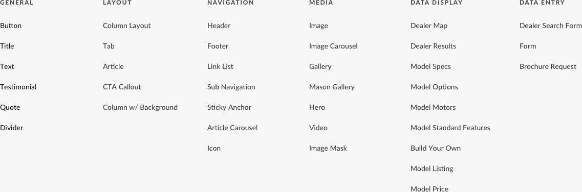
Next we created 6 different component categories; General, Layout, Navigation, Media, Data Display and Data Entry. We needed every component to have a specific purpose. If it did not fit into one of these categories, we questioned if it couldn’t be fit into the functionality inside a pre-existing component.
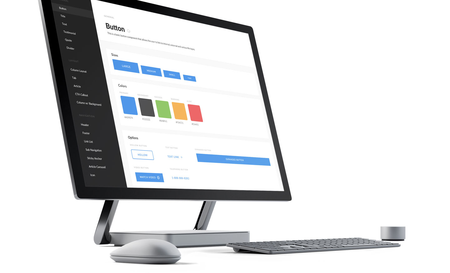
Atomic Design
Next was the component design itself. Instead of only focusing on the UI, I worked on designing components for ultimate flexibility for an author. This required me to have a deep understanding of our framework (Zurb Foundation) and the default classes it provides. I didn’t just want to design a button, I wanted to design a button that could be different sizes, colors, shapes and types, all within the dialog of AEM. All throughout the process, I was trying to think of how each component would be used on multiple websites, each with their own look and purpose.
Learn About Atomic Design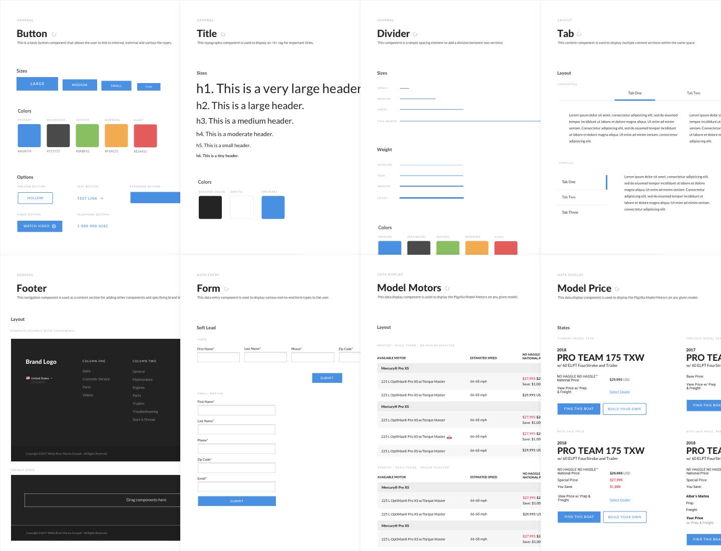
SASS Environment
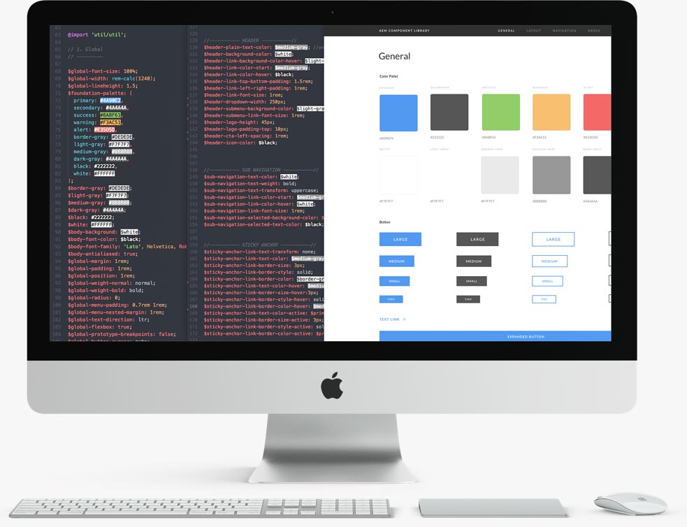
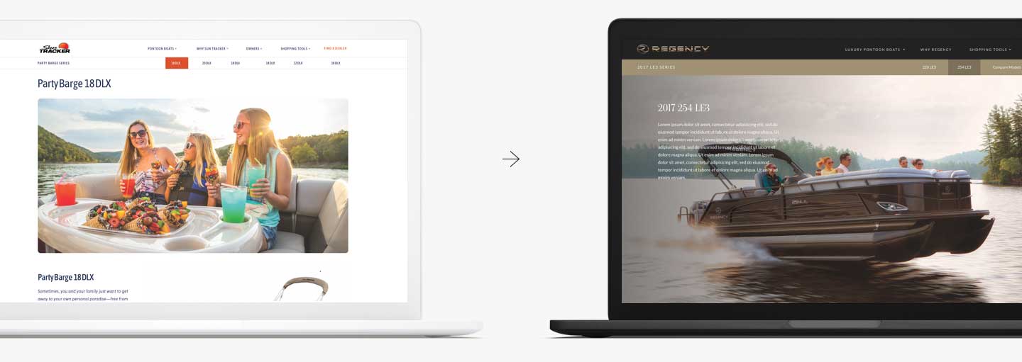
In order to maintain a central design system and component library that was maintained at a global level, we needed a strategy behind to update and maintain our css per website. This led to an approach to focused on elements that define a brands look. These elements were then pulled out into a top-level file and defined by a set variable.
This allowed designers to essentially edit one SCSS file, variable by variable, defining the look without risking core scss that allowed the component to work correctly.
Author UX
For this project, AEM content authors were are target user. They needed the ability to quickly and effectively create content though dialog boxes. This required upfront design based on the functionality of each component. We identified patterns, consistent naming conventions and usability throughout each component. Each component was tested by authors to ensure the design was simple to understand and easy to use.
User Story Writing
Sketch Design System
Last, was a system of Sketch files that aligned with the component library and served as the central hub for designers. The idea was for any designer to know and understand the flexibility of each component. Styles would be defined at the top level and maintained in one file, shared across designers. This allowed a designer to quickly prototype any AEM website and understand where the component library stopped and new development began.
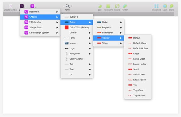
Atoms Core Sketch File
Project Result
Learnings
In reality, this project was a major undertaking. When I pitched the original concept, I underestimated the amount of time, effort and involved stakeholders this project would take. The essential component list was fairly straight forward, but the effort was dramatically increased when we moved to dynamic components. We needed to start incorporating business logic into multiple brands and account for the differences. This takes time, deep understanding and good communication between design, business and development.
We also took a flexible approach for authors as opposed to a more restricted author environment. This is very valuable for unique marketing request, but also has its downsides. This means authoring is not always something a non-designer can do. With greater power, a designer is often required to start or own a content request. Time will only tell with this project, but I often wondered throughout the project how flexible we should take it.